DOWNTOWN BROOKLYN — This season is a new beginning for the Brooklyn Nets and it literally starts on the court.
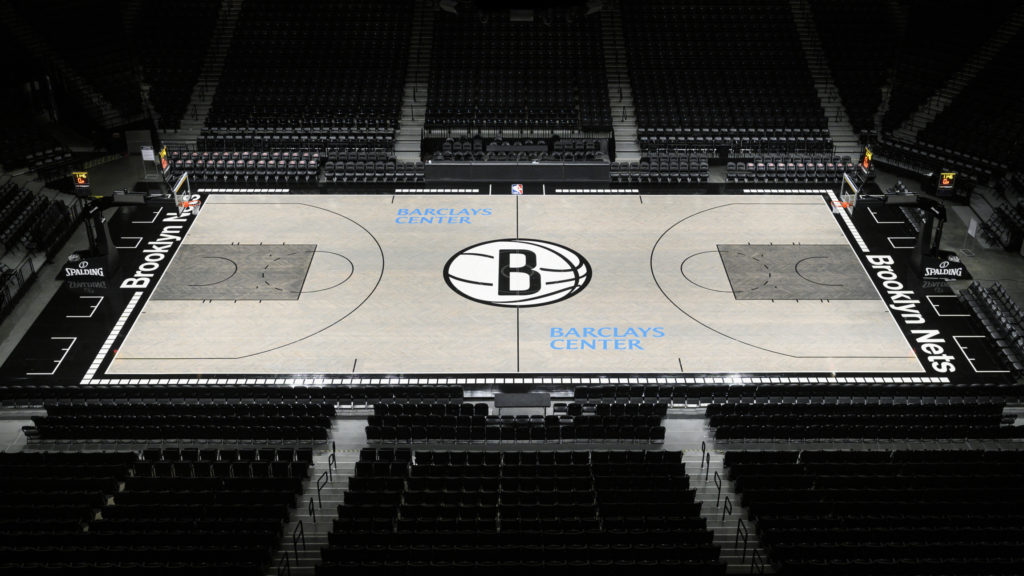
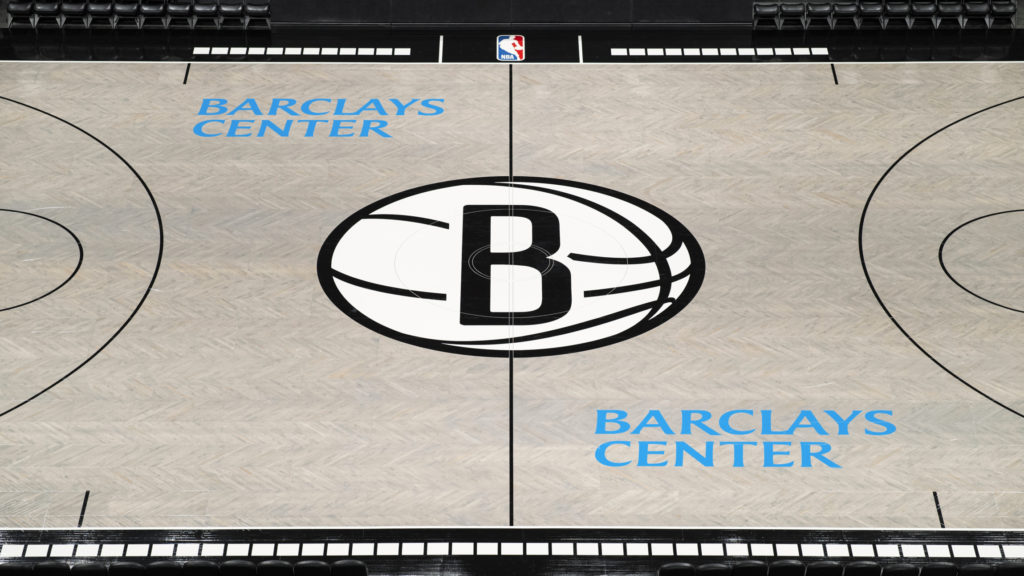
Along with a roster filled with star power and new owners at the helm, the team has announced that for the first time since the franchise moved from New Jersey to Barclays Center in 2012, it will feature a full new court design that veers away from the status quo in other NBA arenas.
There has been a rise in fans’ interest in team court design. Several websites and Twitter accounts are dedicated to court design and ranking them, and popular video game series NBA 2K accurately depicts each design annually.
Around the league, some teams, such as the Toronto Raptors, Utah Jazz, Cleveland Cavaliers and Milwaukee Bucks, have decided to redesign their court or go with a fan-favorite retro one for select games.
With that in mind, the Nets thought it was time for a change.
For the 2019-20 season, the creative team made the colors of the floor weathered wood and concrete gray. The center court still displays the Nets’ iconic Brooklyn “B” logo, but simplified and enlarged. The baselines are adorned with the words “Brooklyn Nets” in typeface inspired by subway signage, with a subway tile pattern running across the apron perimeter.

Jeff Gamble, Nets vice president of content and creative, talked to this paper about what inspired the change.
“We all agreed that the original court was iconic,” he said. “It had that herringbone pattern, darker stain. When we came to Brooklyn, the black and white colorway was unique to us as well, so those are things that we’ve been hanging our hats on for the last few years, and there were no complaints about the court. We just felt that it was a good opportunity for us to take a step back and ask ourselves what we might add to the game experience, to the aesthetic experience. As we thought about the court, we started to realize there might be an opportunity here and as we got into the spring, we collectively decided to take advantage of it and see what we could come up with.”
The creative team wanted to make sure they anchored the court with echoes of the prior design, avoiding a full departure from the original design, Gamble said.
“One of the elements that was non-negotiable was the herringbone,” he said. “We wanted to maintain that pattern so that was our starting point. We had a robust conversation internally with GM Sean Marks, our CEO and all the stakeholders about what we thought might be a good idea for Brooklyn, the borough and the industrious nature of it, and how there are so many concrete asphalt playgrounds, things you can draw inspiration from.”
Gamble and company then used that coloration as the starting point for the court, resulting in a new look that represents a departure from what the other 29 teams are doing.

“We weren’t sure how we would be received by the NBA,” he explained. “They have to approve all of these changes. But we put our best foot forward and ultimately they were on board with the concept. There was some tweaking along the way but we ended up essentially where we wanted to and we are really happy with the results.”
The popularity in fans’ interest in redesign has led teams to take more risks.
Court designs, Gamble said, “Used to be pretty standard.” Now, however, “You see college teams and NBA teams really extending themselves in terms of those designs. We wanted to be careful not to feel like we were trying to do too much. We kind of have a less-is-more approach and we wanted this court still to be clean and feel timeless.”
The impetus to innovate may be rooted in social media, Gamble said.
“I’m speculating but as we’ve gotten into digital age, where everybody comments and has input, and social media interactions have skyrocketed over the years, everything from court designs to jersey designs to schedule releases have been amplified,” he said. “In years past, maybe you have a press release, not a lot of hoopla, but now everything is accompanied with a lot more.”
The reception, Gamble added, has been positive, including a video on Sports Illustrated’s website featuring Robin Lundberg praising the new look and calling the Nets the coolest team in sports.
“It’s great. It’s fantastic and that’s what we had hoped for,” Gamble said. “For us, it’s about getting that positive reception from fans and guests that come to Barclays Center. Not to say it becomes competitive. We’re not looking at it that way. We just want to represent our brand the best way we can. We thought this was a good way to do that.”
 Cyclones return home after southern discomfort
  Mets’ first-round pick is anxious to contribute